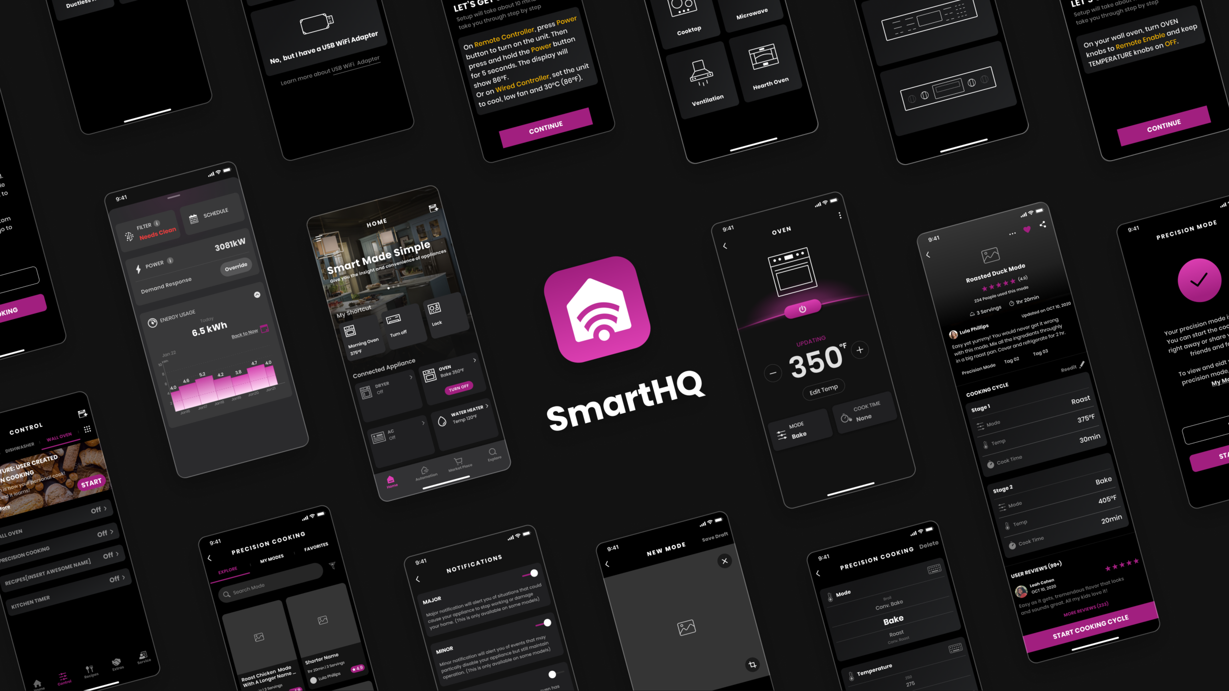
SmartHQ 2.0
OVerview
SmartHQ app is the sole IoT app that works with all connected appliances by GE. The basic function of the SmartHQ app is to monitor and manage the connected appliances. The app was built one year ago and currently receiving unsatisfying reviews. Although most issues are linked to technical bugs, the usability and design of the user interface can assist in alleviating user frustration. Our design team seeks to provide a more intuitive and consistent design that provokes user engagement and ease of use when interacting with the app.
:/ UXUI Design & UX Research
:/ 2021.03-2021.07
:/ Teamwork with two UX designers and two UX researchers
My Contributions
Identifying problems of the current experience of controlling and monitoring connected appliances,
Ideating for design solutions, creating prototypes for usability testing,
Making iterations, and scoping for future updates.
Full Project Scope
I participated in all aspects of the project and my major parts are highlighted as below.

Problem Statements
How might we redesign an intuitive interface that provokes user engagement and ease of use when controlling and monitoring appliances with the SmartHQ app?
Solution Highlight
How We Shoot for the Moon 🌝
Understand
:/ Business & Team Expectations
Different products might have their unique features and logic to control, but the design should be consistent across all connected appliances.
Features of a product are constantly updated, it would be better if the design could accommodate long-term changes.
Safety protocols of appliances have requirements on certain control components. For example, the power button of the oven and range should be quick and easy to locate.
:/ Users
We tried to identify and understand SmartHQ users’ needs when interacting with the interface to monitor and control their connected appliances:
Intuitiveness - better understand the functions of different components;
Scanability - quickly locate the effective content;
Efficiency - Efficiently operate tasks with prompt and clear feedback ;
Consistency - Visual and interaction consistency to lessen the learning curve
:/ Problems
We had a design walking-through of the current interface to understand the flow and intentions of the design.
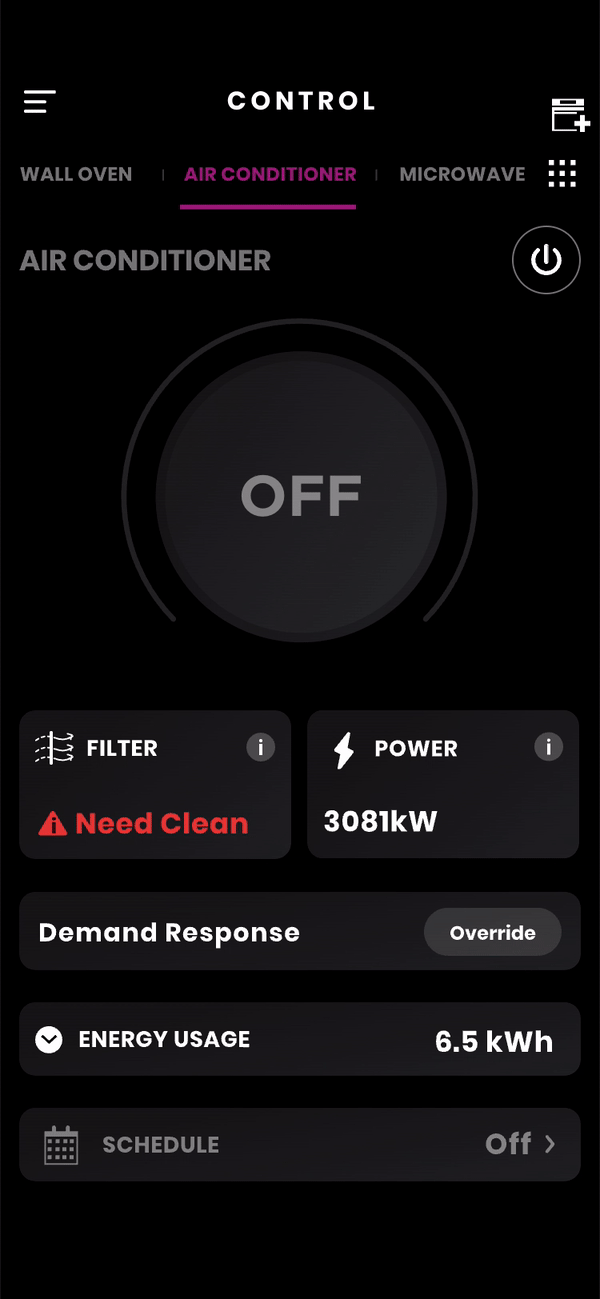
Let’s take the control page of a window air conditioner as the main example.

Bearing the usability heuristics for UI design in mind, we deconstructed the current design of the control page and got picky about what can be improved. We discovered the usability problems with the current design, considering various product lines, including air, laundry, cooking, fridge, water, and dishwasher.

After discussing with the design team, we concluded the major problems that cause pain for users to gain effective information. And we pinned down our design opportunities in the redesign.
Key Problems
Unclear information architecture and hierarchy, and lack of a standard for classification of the information;
Disordered visual hierarchy;
Text-heavy, ambiguous and inconsistent components.
Let’s try fixing them
Classify and stratify the information on the control page, ie. grouping and prioritizing all elements and features to provide a more clear Info architecture and hierarchy;
Leverage more visual elements like colors and icons, design with more spaces ;
Design uniform design components, with self-explanatory interaction to sever different functions across multiple product lines;
Tackling the Problems
:/ Navigation
Working with other designers in our team, we decided to simplify the top-level info architecture of the app (the Tab bar), leaving the entry point to the control page only on the home page. We made each control page dedicated to doing their job and removed the problematic scrollable bar.

:/ Information hierarchy
One of the focuses of the redesign is to build a better information hierarchy, especially for the control page. We gathered all typical control pages of the main product lines, deconstructed and categorized the information and control components of each product line, in order to have a clear idea about the page structure and the scope of the task.
By color-coding different information and control components of each product, I tried to better visualize the page composition and help find the patterns of the control components. All features are ranked from most used to least used.

By using different methods to deconstruct and reconstruct the pages and inspecting the results, I tried to define a rule to categorize the information and elements which need a certain degree of flexibility to fit various product lines. And finally decided to regroup them into these 5 sections:
Appliance Icon & Power Button
Prioritized info
Primary control
Advanced cycle options
Secondary info

Wireframe (Samples)
I wireframed iteratively and experiment with UI component styles and animation styles to determine the best experience for the user. I collaborated with other designers and project stakeholders and users along the way to validate concepts and gather feedback to continue improving the experience. One of the biggest challenges is that the design should be compatible across multiple product lines including AC, laundry machine, oven, cooktop, water filter and etc.
:/ Early Exploration

:/ Prototyping for User Study
For the scope of user study, we chose 3 appliances - air conditioner, oven, and dryer. We wrote task prompts for each appliance based on common usage scenarios and designed the relative prototypes.


User Study
Collaborating with the Lextant team, we conducted online research interviews as an iterative study for the SmartHQ app. I worked with UX researchers to create task prompts and a discussion guide for the usability testing with the interactive prototype.
The key objective of the test is to evaluate the performance of the prototype [System Usability Scores (SUS)] and what users think about the new designs. After conducting usability testing, we all got together to understand what worked in the prototypes and what did not work.

:/ Key Test Findings
😀 Most users thought the prototype version was a significant upgrade.
The average SUS of the tested prototypes (81.5 out of 100) showed success in significantly increasing usability performance, compared to the current SmartHQ App.
😀 Users liked the quick access for major control and found the interface style to be more appealing.
For example, users could easily change the temperature control using the +/- button or “Edit Temp” and were pleasantly surprised at the two options. And they thought the interface is more visually engaging.
😕 The swipe-up page didn’t work well.
It saw an average increase in the task time and a decrease in satisfaction when interacting with the swipe-up bottom page.
🙂 Details to be improved
A lot of helpful feedbacks from the test participants were collected to further improve the UI concept.
Refine
Based on the feedback from the tests and team discussions, I further improved the design of the wireframes.
:/ Swipe up page
Problems Users didn’t know what to expect in the swipe-up page and didn’t get used to the interaction.
Solution Remove the swipe-up bottom page, group the secondary info items and relocate them to the appliance’s main screen for quick access from one page.

:/ Updating Message
Problems Users were confused if the system registered their adjustments and were expecting additional confirmation (e.g., change in temperature, mode, or fan speed).
Solution Add a visual confirmation that the edited temperature has been registered with the appliance. Instead of using a popup window, an “updating” message is integrated with the existing tagline.
Before
After
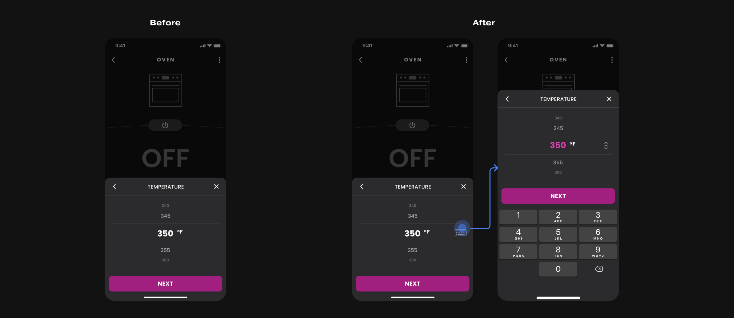
:/ Keyboard Input
Problems Some users found the number picker with a large range of selections cumbersome and easy to overshoot when selecting and would prefer a more direct selection option.
Solution Provide a pin pad for all picker style settings as a secondary option;
Remember users’ preference, i.e. default to the pin pad if they switch to that option previously.
Final Pitch
Before and after
